Macworld Make iOS 7 less nausea-inducing
iOS 7 has many snazzy effects and cool new animations, but it's not for everyone: Some users have reported feeling dizzy from the operating system's motion effects, while others (my father included) are having issues reading the system's default text. But you don't have to deal with feeling ill every time you look at your iPhone—there's another way. Here's how to de-animate and re-boldify iOS 7.
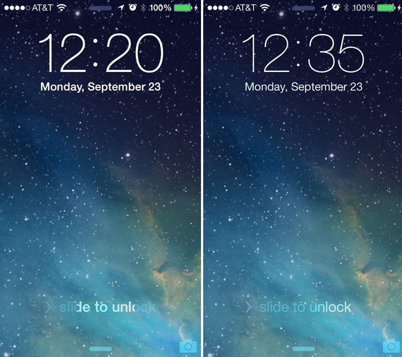
Reduce motion in iOS 7
If the dynamic wallpaper movement on iOS 7 has you feeling seasick, don't panic: There's no need to throw your iPhone overboard. You can disable this animation and iOS 7's other more drastic shifts by going to Settings > General > Accessibility > Reduce Motion.
After you flick this switch, your home screen wallpaper should once again be as still as it was in iOS 6.
Make the text larger and bolder
Having trouble reading text in your apps? There are two solutions hidden away in Settings > General > Accessibility. The first, Larger Type, hooks into iOS 7's Text Kit framework and lets you set a predefined text size for apps to use; you can make that text even bigger by flipping the Larger Dynamic Type toggle. Currently, Larger Type only works for apps that support it—this includes any built-in app on your device, but your third-party programs may not yet have implemented this feature.
 TO BOLDLY GO Turn on the Bold Text switch to embolden fonts in iOS 7 (left).
 If it's not large text you seek but thicker text, iOS offers a Bold Text option within the Accessibility screen. Enabling it does require rebooting your iOS device, but after you do so, your device's default font is bolder all around.
Increase Control Center and Notification Center's contrast
Thanks to iOS 7's new layered view, Siri, Control Center, and Notification Center appear to float above your current home screen or app when you open them. Sometimes, however, that contrast is a little rough, making it hard to see what's on that top view.
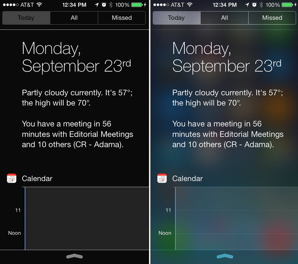
 DARKER TIMES Turn on the Increase Contrast switch to flatten the layers below Siri, Notification Center, or Control Center (left).
The Increase Contrast switch, found under Settings > General > Accessibility, removes the subtler blur in favor of a straight transparency gradient.
Make sure a switch is on or off
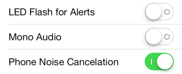
If you have trouble with color, the On/Off Labels switch in Settings > General > Accessibility enables shapes under iOS 7's white-and-green switches so that you can tell when one is enabled or disabled. (The circle indicates a switch is disabled, while the vertical line indicates it's enabled.)
 SHAPE SWITCH Enable the On/Off Labels toggle to add shapes to your switches.
 http://www.macworld.com/article/2049249/make-ios-7-less-nausea-inducing.html#tk.rss_all
Sent with Reeder
Brief message sent from a handheld device.
No comments:
Post a Comment