I've slowly come to some realizations about customer service....
While my group and I provide support on all levels to our clients, we are the clients of a good many vendors.
Much as many end users of computers and technical products are reluctant and anxious about contacting support, often times technology professionals have the same feeling about contacting their vendors for support because of a history of poor experiences with the vendors. Often times the vendors will make us, technology professionals feel as though we're bothering them and that they often treat us as rubes in working with deep technical areas of their products.
A couple of things on the above paragraph... It's a good reminder for technology and any other support group to treat the client as they would like to be treated.
The other thing that I've come to realize is that the better customer service companies tend to have a few things in common:
1) First call resolution--the better vendors tend to either have techs capable of answering the questions also answer incoming calls or there's some information gathering and the call is then transferred immediately.
2) The technicians are extraordinarily polite and capable, a relatively rare blend in a technical field. People with both capabilities cost more than people who are strong at one or the other (or neither!).
3) The products tend to be very good. They aren't always the best of breed but they're never more than half a letter grade away from the best. Half a letter grade but approachable and friendly and helpful are INFINITELY better than getting that half a letter grade unless you have internal personnel who are experts on the subject matter, IMHO.
4) The better support companies *tend* to want to hear how they've done. While I'm not a big fan of sending surveys out after every single support call (death by survey, as a friend of mine says), my top-rated experiences are followed up with surveys.
These are commonalities that I've found, maybe you've found others. One company that continues to impress me with every call we make, regardless of it being a trouble issue or a configuration question, is Barracuda Networks. These guys are on 24/7, super helpful, and super friendly.
I know foreign outsourced tech support often gets a bad rap but we had to call Computer Associates today and the call went to their Indian tech center, normally it goes to the east coast support but not today. Our experience today with the Indian support group was far better than what it was with the US based office. Go figure!
Some of the other good ones I've dealt with recently include Perceptive Software, HCSS, Sage.
N.B. I've not received anything free from any of these companies, but my experience has been very good or great with all of them.
Friday, October 30, 2009
Tuesday, October 27, 2009
Halloween Horrors: 5 Spooky TV Shows You Can Watch Online
The Adam Curtis videos are quite interesting!
Halloween Horrors: 5 Spooky TV Shows You Can Watch Online: "From suspenseful classics and offal cook-offs to truly terrifying documentaries, the internet has you covered when it comes to scary stuff to assault your eyeballs."
(Via Wired: Top Stories.)
Monday, October 26, 2009
10+ reasons to split an Access database
Amen, I'll save this for the next time I encounter someone looking to buy or build a huge program based on Access.
Access, in my opinion, is a great front-end but as an actual database [back-end], it's pretty scary!


 "
"
Access, in my opinion, is a great front-end but as an actual database [back-end], it's pretty scary!
10+ reasons to split an Access database: "
Splitting your Access database offers numerous advantages, including increased flexibility, security, efficiency, and scalability.
Access is a desktop database, and you can store data and interface objects in the same file. But most developers agree that a split database is easier to protect and maintain. When you split an Access database file, you end up with two .mdb files instead of just one:
- The backend stores the data in relational table.
- The front end stores the interface objects.
By linking the two files, users can view and manipulate the data in the backend via the forms and reports in the front end. This arrangement solves a number of problems inherent to the Access file structure.
Note: This article is also available as a PDF download.
1: Multiple users share the data
Perhaps the biggest incentive for splitting a database is to supply data to multiple users over a network. By storing the backend on the file server and distributing the front end to workstations and users, many users can access and manipulate the data.
Whether you store the front end on local systems or on a server is an ongoing debate among developers and administrators. There are pros and cons to both sides.
2: Your data is better protected
Whole books have been written on database security, but it’s enough for you to know that you must protect your data. One of the easiest ways is to split your database. Placing your tables in a backend file protects your database design because users can’t directly access the tables via the interface objects in the front end. Therefore, they can’t alter or delete tables, even accidentally. Most of the users working in the front end won’t realize they’re actually working with two separate files, so splitting the database will have no negative impact on your users.
However, this arrangement is not a comprehensive security lock on design. Users who know what they’re doing can still open the backend, if they have access to it. Just bear in mind that splitting the database will minimize accidents — but it won’t stop someone who’s determined to get at your tables.
3: You can plan for the future
If there’s any chance that your Access database will grow out of its skin, consider splitting the database. It’s easier to upsize a split database to SQL Server (or some other larger relational database system) because you can easily link the existing front end to SQL Server tables. That way, the organization has the advantage of storing data in a larger database with most of the perks that come with doing so, while still using the Access front end. (Most Access front ends will require light to moderate conversion to view and manipulate SQL Server data.)
Many organizations stop there. However, a modified Access front end that’s linked to SQL Server, can also buy you time. You can keep the Access front end in service while developing a more robust front end for the SQL Server data.
4: The user interface is easy to modify
Most databases grow and change with the business; they require new features or modified business rules. Changes to existing tables are rare, if you properly normalized them early on. Most changes will be in the front end in the form of new or modified forms and reports.
As long as your database is split, testing and implementing changes to the front end can occur with little or no disruption to users. You simply link the development front end to the production backend and test away. This won’t always be the case, of course, but testing new interface objects is easier in a split database configuration.
5: You can use a shared security model
Access 2003 and earlier have a workgroup security model that’s pretty good. It’s easy to understand and implement and does a decent job of protecting schema and data. If you split a database, security isn’t a problem. That’s because the linked tables in the front end will adopt the same workgroup security rules applied to the backend.
In addition, developers find securing a split database easier because the backend is less crowded. Many developers stop with the backend, but your needs should dictate how heavily you implement workgroup security.
6: Deploying a new front end is a snap
If the user interface and data are stored in the same database, you must replace the entire database every time changes are made. That means you must import data from the existing tables into the new version. That’s a lot of unnecessary work and can require remote access to the database if you’re not physically near the system and there’s no one in-house with the expertise to do it for you.
In a split database configuration, you simply replace the front-end .mdb file and relink the tables. It takes a few minutes and requires little interruption of users.
7: It makes life easier for offsite developers
A split database is easier for offsite developers to maintain and upgrade. The developer works offsite to implement changes and enhancements to the front end and then ships the new version to someone in-house who has the technical expertise to deploy it. This latter process is a simple copy and relinking task that doesn’t require high-end expertise. You can train someone to do it or even talk someone through it over the phone. Many developers write a routine that automates the process. All the in-house technician has to do is double-click the installation file. This opens up a lot of long distance opportunities that a developer just couldn’t manage as easily with a single database file.
8: Job security is enhanced
Once the database is in production and running smoothly, clients will want changes and new features — they almost always do. Knowing that you can develop and implement changes with little to no disruption, management is going to be more inclined to contract you to make those upgrades.
9: Multiple developers can work more effectively
A split database allows multiple developers to link to a backend in a flexible and efficient arrangement. Developing from a single database file would require precise and specific coordination and synchronization. Developing in a split database frees up resources for actual development rather than management.
10: Everyone’s using the same data at the same time
By splitting a database, you know that all users are accessing the most current data because everyone’s accessing the same data. Not only are they all accessing the same data, they can all update it at the same time. That means a change made by one user is almost immediately available to all other users. (Locking may slow things down.)
Having a backend corrals all the data into a single database file. That means there’s only one copy of that data to manage and protect. Changes are immediate and available to all authorized uses. Any administrative duties (which are few to none with an Access database) are implemented in the backend file, once.
11: Geography’s not a problem
A split database allows users in different locations to access the same data. For example, the backend may be on a server at company headquarters in Atlanta, but users from all of the country can access the data via their local systems.
12: Corruption is limited
Access databases are prone to corruption. One of the easiest ways to avoid this problem is to implement a split database, which is less prone to corruption.
13: It’s easier to get individual users back on track
Security in the front end is one way to limit user interference. However, some users require more flexibility than others and there are always trade-offs. Some applications will require tight front-end security, while others will allow more freedom to tinker.
When a user tinkers to the point of destruction, a split database is easier to repair. Rather than bringing the entire application and all its users to a screeching halt, you have only one user who’s unable to work, momentarily. The fix is usually as simple as recopying the front end for the troubled user.
Check out 10 Things… the newsletter
Get the key facts on a wide range of technologies, techniques, strategies, and skills with the help of the concise need-to-know lists featured in TechRepublic’s 10 Things newsletter, delivered every Friday. Automatically sign up today.
(Via 10 Things.)
My Windows 7 Notes
I'll be updating this post as I continue to work with a production version of Windows 7.
One of the new features that I was excited about was the ability to burn DVDs within Windows, not requiring separate software. Having a need, I popped in a blank DVD into my 6 hour old Lenovo G550 and chose the option that popped up to burn it like a USB drive. I have about 3 GB worth of data to move to the DVD and at present, less than 25% through the process, it's reporting 3 hours remaining! Ack, it would have been done by now on my MacBook (~10 or 15 minutes for comparable data, if that). I'll play it out, see how it goes.... Maybe there are other options that I missed....
One of the new features that I was excited about was the ability to burn DVDs within Windows, not requiring separate software. Having a need, I popped in a blank DVD into my 6 hour old Lenovo G550 and chose the option that popped up to burn it like a USB drive. I have about 3 GB worth of data to move to the DVD and at present, less than 25% through the process, it's reporting 3 hours remaining! Ack, it would have been done by now on my MacBook (~10 or 15 minutes for comparable data, if that). I'll play it out, see how it goes.... Maybe there are other options that I missed....
Sunday, October 25, 2009
In Depth: How to create your best website layouts ever
In Depth: How to create your best website layouts ever: "
Ah, the blank canvas: probably my favourite part of the design process.
What I love about it is the multitude of opportunities it represents: free rein to create without being encumbered by any of the restrictions that come into play further down the line. Anything can happen!
There are a number of ways to approach this stage. Some like to jump straight into Photoshop (or their layout tool of choice), but personally I try to stay 'analogue' for a while and work with good ol' paper and pens.
Such tools are far more freeing than using a mouse and computer screen. They enable us to throw down ideas as soon as they come into our heads and be as expressive as possible, having absolutely no concern for things like neatness, which – at this stage, at least – just get in the way of creativity.
If you haven't worked this way before, give it a try: it's extremely liberating.
To get further outside of your comfort zone, try doing your sketches in a completely different environment to where you do your more finished designs. If you're not using a computer then you can travel light and not worry about things like electricity, so use it as an excuse to get outside. If it's a sunny day, find a patch of grass. If it's raining, revel in the hustle-and-bustle of your local coffee shop.
The sketchpad
My weapon of choice at this stage is my trusty A5 pad, which is just small enough to carry around easily but just big enough to fit in plenty of ideas. I prefer a blank one myself – because it feels the most 'free'. Many designers favour the Moleskine.
Later, when you're getting ready to neaten up your sketches (obviously it's impractical to continue down the path of freeform messiness forever), using square gridded paper can be a great way of deciding on your own grid structure, but more on that in a moment.
If sketching is a new concept to you and you're not sure of the best way to approach it, try this exercise. Look at an existing website – ideally, one created by a designer you admire – and re-create it as a rough sketch in your pad.

SKETCH IT OUT: Sketching out sites designed by others can be a great way of rethinking your own approach to layout
Firstly, this will help familiarise you with the relationship between sketch and finished product. Secondly, with long pages that have lots of content, it'll help clarify how an entire page fits together – that is, the full height of any given page rather than just the bits we see in the limited browser window.
Sketching is a handy way of coming up with ideas, and refining your sketches before jumping into Photoshop means you can sort the good ideas from the bad quickly, without wasting time in an actual layout app.
However, there's no point in refining sketches too much, because detailed design is best saved for the medium in which it will eventually be experienced: the screen. Personally, I sketch in my pad until I become frustrated enough that I'm not working out the technicalities in Photoshop. At that stage, it's time to start blocking out elements using wireframes.
Wireframes can mean different things to different people, and even vary from project to project. Some designers or clients like wireframes to go into great detail and define exact proportions of the grid that the site will eventually follow. Others treat them as nothing more than 'neatened up' versions of the most refined sketches.
In reality, there are no hard and fast rules to live by, except to say that wireframing should enable you to see how the website will be laid out before any of what I call 'the pretty stuff' gets added on top.
As I said in last issue's article about working as a solo web designer, this is why it's a good idea to separate out the wireframe and aesthetic stages of design: although they're both parts of what you could liberally call 'the design phase', they focus your client's attention on different aspects, one part at a time.
Very loosely, you could say that wireframes enable them to think about layout from an interaction point of view, and aesthetics let them concentrate purely on the emotive experience.
Whether you decide to define your exact grid during the wireframe stage or later, when you approach the 'proper' design, is an important decision.
A popular grid is the 960 Grid System, which – at 960 pixels wide – can be divided into many different inner widths, such as 16 or 12 equally wide columns with gutters.
However, it doesn't really matter which grid you use, be it your own or one created by others, because ultimately it should be one that suits the content and provides you (the designer) and others (the site's maintainer) with a guide that allows for the aesthetically pleasing alignment of a variety of different page elements.
Carried across a site's various pages, this considered alignment helps create a visual consistency. In his presentation 'Walls Come Tumbling Down' , designer Andy Clarke reminds us that for large sites with a lot of dynamic content, we're designing a system, not a page. (Andy is also a big fan of creating your own bespoke grids that are dictated by the site's content. A number of his experiments with varied grids can be found here).

EXPERIMENTAL: Andy Clarke's experiments with alternative grids are legendary. Here, he presents the poem in a traditional book format
For more on grid-based theory and how principles from the art world can assist with our layout choices – such as using the Rule of Thirds or the Golden Ratio to define your relative widths – see Mark Boulton's book A Practical Guide to Designing for The Web or my own recent book, Sexy Web Design.
So, with our sketches informing our wireframes and our wireframe helping to formulate the grid on which we'll base the actual design, it's time to move into the meatiest part of the project and start turning our ideas into something that resembles a functioning website.
My tool of choice for this task (and the wireframing stage before it) is Photoshop which, although not perfect, is a powerful program that enables me to visualise what I have in my head in the quickest and easiest way, at least in the first part of the design phase.
Others prefer Fireworks, which was created for the specific task of designing for the web. But again, the tool is not important: it's what you do with it that counts!
As time goes by, I find more and more that there isn't really one tool to do all the jobs I need, and I find myself increasingly turning to the browser and treating it as a design tool in itself.
There's one easy-to-spot reason why designing in the browser makes a lot of sense: it's where the site, once finished, will be viewed. There are a variety of other reasons, but for me typography is one of the biggest ones – I've yet to find an application that can accurately simulate the way type appears in the browser, and as text is rendered differently in different browsers and on different operating systems, there's no one true 'correct' rendering anyway.
Designing in the browser is also a massive time-saver. Changing a line or two of CSS to affect something like column width or line height across an entire test site will often be much quicker than making the same changes in a mock-up, where the change would need to be made across several elements, re-exported and so on. It also means testing to see what works and what doesn't can be done in seconds.

BE FLEXIBLE: Flexible widths, like those on clearleft.com, are tricky to represent in static Photoshop mockups – a great reason for designing in the browser
Consider a 20-page site where each page has 10 divs containing text. If you have a mock-up for each page, it would be a huge job to change the gutter width between each text block from 10 to 15 pixels. But with a browser, you only need to open your stylesheet, change something like div.text { margin:0 15px } and you're done. Just hit Save and then refresh your browser!
37signals is known for favouring browser-based design. In his post 'Why We Skip Photoshop', Jason Fried explains why the company jumps straight to HTML and CSS: 'You can't pull down menus in a Photoshop mockup, you can't enter text into a field in a Photoshop mockup, you can't click a link in a Photoshop mockup. HTML/ CSS, on the other hand, is the real experience.'
My opinion is that this approach should be used where appropriate. I still do 80 per cent of my design in Photoshop and use browser-based design for tweaking and making the more intricate decisions about typography, for instance.
Photoshop is a necessary tool for graphics-heavy sites (something I tend to produce rather a lot) but is understandably not as necessary for a company like 37signals, as its products use less imagery and favour simple blocks of colour and text-heavy elements such as multiple form fields.
Once again, it comes down to choosing the most appropriate tool for the job. However, another reason it's worth considering browser-based design is that it will instantly show you how your site appears, not only on multiple browsers but also on multiple devices.
No designer can ignore the increase in demand for mobile compatibility, and while that has been made a little easier with the popularity of the iPhone and Mobile Safari's desktop-like experience, there are still key differences. With difference comes broken layouts, so it makes a lot of sense to see if and where they're happening as soon as possible.
Working with fixed layouts has always been the easiest option, but with elastic and fluid layouts it's a different matter. This adds an extra layer of uncertainty, as more parts of the design are allowed to move, so multiple scenarios need to be considered. And how do you show these changes in a flat mock-up?
There's no question about how awkward this is to do in Photoshop, where you'd need to create multiple versions of the page, rendered at different widths. If you're creating elastic or fluid layouts, designing in the browser is worth doing as soon as possible in the process.
Layout constants
I'm a big fan of trying to design sites that break from convention and do something a little more interesting than all of the other clones out there.
However, innovation is only effective when it's balanced with conformity and let's face it, sometimes we've just got to conform! Hence there are some elements in web design that appear time after time, and why not?
Take the humble header: it's hard to come across a site that doesn't have one. But a clearly defined header adds some site-wide branding and consistency, and when it contains navigation, it gives users a guaranteed base to which they can return and find their way around.
Headers needn't actually be at the top of the page, either: I think of them more as a point of focus. Take balhar.com for instance: the 'header' is actually a strip that appears vertically centred in the middle of the screen.
Huge footers seem to be all the rage these days, and for good reason. If you consider the common sidebar, a regular feature on blogs especially, there's a lot of information there that sits alongside the actual content (which, on blogs, is usually the post).
The trouble is this that the sidebar often contains elements that don't necessarily relate to the post itself: think of the search box, generic category listings, links to recent comments on other posts, etc. Why clutter up your page with these things that detract from the main article being read?
Sure, there are valid reasons to give prominence to these elements, but often we throw these things together without even thinking. Not so with the big footer: it's a way of presenting large amounts of disparate information (such as blogrolls, social network links and daily bookmarks) without interrupting the flow of reading the main article.
If there's one area in web design I find exciting right now, it's the concept of art direction being injected into the way we approach layout: something that, until recently, was sadly lacking in our online world.
Popularised by Jason Santa Maria's approach to his blog entries, the mantle has now been picked up by a number of designers who are aiming to treat their blog posts with the amount of care usually reserved for offline magazine articles.
The key thing is that each post has a unique design, or variation on the 'base' design, and is thus a unique experience in itself. Rather than succumb to the rigidity of templates (something we're all guilty of), each article gets designed according to its content.

MIX IT UP: Each article has a distinct personality, echoing the best of magazine design
Dustin Curtis' site is a great example: apart from the nav bar and footer, every single page looks completely different. Greg Wood's site is another example in a similar vein, with even fewer constants. Each article has a distinct personality and looks absolutely beautiful.
Of course, art directing every single page isn't something that can be applied to all websites. In fact, if we're being honest, the number of sites that would be suited to this approach is relatively small. But it goes to show that layout on the web is finally growing up and we're starting to achieve something that print design has enjoyed for years.
Even if this only serves to impart a subtle influence on other sites where full-on art direction is unsuitable, it's undoubtedly a great thing, and a sign that web designers are no longer afraid to do what they do best – design!
Related Stories
 |  |
(Via TechRadar: All latest feeds.)
Saturday, October 24, 2009
In Depth: Easy ways to take payments via your site
TechRadar is rapidly becoming one of my favorite sites for anything tech. Not only are their product reviews quite comprehensive and practical, but then they throw in these useful little gems every now and then.

 "
"
In Depth: Easy ways to take payments via your site: "
Recession, global competition, busy consumers, fraud, investors seeking to reduce costs. Not since the early faltering steps of ecommerce has there been so much pressure to show tangible results and realise every last ounce of value.
Every business with a sales presence online is aware of the old favourites, context and content, being king. In tight economic times, cash and conversion are also regal in their importance.
For those already operating online shops, are there ways to focus on greater efficiency? For those looking to get into the market, what are the payment options available and what needs to be considered?
Much has changed in the past five years. More providers and better solutions are available now. However, broadly there are still two main ways to take payments on your site using commonly available solutions.
The first and most readily seen globally is of course credit and debit card payments being processed either through a direct connection to a banking partner (usually preferred for large-scale complex uses) or via a payment gateway (which can usually help with everything from small- to large-scale use).
The second way to take cash involves third-party payment services like Amazon Flexible Payments, Google Checkout and PayPal. Let's consider the costs, questions you might want to consider, some of the differences and some examples of where they may be relevant to your business.
While looking at the two different sorts of service and how they compare, it's worth having an open mind rather than picking an outright winner. A mix of more than one service is the ideal solution for almost all medium and large retailers.
Those already using a service could potentially benefit from supplementing a gateway with a service like PayPal; those using just PayPal could find their credit and debit card conversions rise when using a gateway.
Given that there's always a risk of outages affecting a service, even for large gateways like Authorize.net, now's the time to consider spreading your risk across more than one provider. While any provider is going to be helping you earn money, an important consideration has to be cost.
This can sometimes be hard to clarify. Along with the cost of getting your money into the right bank account, there may be developer costs from integrating the payment service, design costs from making it look snazzy, consultancy costs from setting up conversion funnels tracking or security, and audit costs if you work in a way requiring you to be PCI-compliant.
Many providers will charge a set-up fee, which may include setting up your Merchant ID, a monthly access fee, a transaction charge, a processing charge, a fraud profiling charge, reporting charges, refund or chargeback costs and conversion charges if you work in more than one currency.
The cost of banking
For small and medium businesses, the simple route of working with your business banking provider's solution – such as ePDQ from Barclays, Merchant Services from HSBC or Streamline from NatWest – can appear easier. But these may be costlier than shopping around, depending on their current deals.
Likewise PayPal, which can help make small payment values cost-effective to process through their service, could be more costly than other providers for credit and debit card transactions.
If you're new to the world of payments, services like PayPal (and Amazon Flexible Payments Service, depending upon your territory of operation), or third parties that set you up quickly like Netbanx or 2checkout, may charge from 4 to 10 per cent of your transaction amount.

FLEXIBLE PAYMENT: Netbanx enables you to process global payments via a range of payment types
Relatively new providers like Google Checkout may be more willing to be competitive with their charges and offer incentives such as a free Google AdWords budget to new merchants using their service.
Once you have more of a trading history, it's well worth looking at gateways, where the transaction costs are likely to be in the region of 2-4 per cent, such as WorldPay, CyberSource and a raft of big players in the gateway world.
There are some generally accepted costs in the world of payment – debit card transaction costs are usually a fixed amount not a percentage, and credit card transaction percentage charges vary from Visa and Mastercard to Amex and Diners.
For some merchants, the added cost of setting up more exotic cards like Amex – you need a dedicated MID, plus there may be extra transaction charges – make their value questionable. However, for merchants dealing with high value items or experiences, or corporate services like b2b reports, they can be a necessary addition.
For newer, low volume sites it's usually worth taking on a higher transaction fee for lower fixed costs while you get up and running – then review the basket size to know when a fixed monthly fee plus a lower transaction fee is more cost-effective.
For higher volume and more established sites, negotiate to reduce or remove monthly fees and review the percentage for transactions – like all other markets, it's worth shopping around among a few providers.
As well as the cost of the provider, there are some other key ways you might end up paying for the service; not least is through how it impacts your conversion rates.
Design
If you have a beautiful ecommerce experience connected to an ugly payment process branded solely and heavily with 'Payments R Us', you'll be reducing your conversion rates. The benefits of transacting in a secure and obviously payment focused environment are undermined by the jarring and often concerning feeling of moving to an alien environment.
It's worth checking how much you can customise the payment provider's interaction with your customer. It might simply be a case of adding your logo or CSS to improve the look of their pages; changing labels on buttons and copy in receipt emails; or being able to determine the eventual redirection out of their payment process back to your site.
All these things help keep your customers happy – as businesses grow, the degree of customisation expected by customers seems to grow too. Some payment gateways offer an 'invisible' service whereby your site captures all the payment information and passes it to their servers. This sort of service can help raise conversion considerably, but it requires your site to be PCI-compliant.
Unless you're a medium to large retailer/online commercial outlet, it may well not be worth the added technical complexity. If you're a larger player, and have a willing technical partner and audit/security partner, however, it's well worth investigating.
Integration
Once you're happy with the cost of the provider and you've investigated how closely you can integrate the look of it into your site, you might want to consider how the provider can connect to other systems you're using.
It's worth investigating how data is made available to you and what data you can access online.
Can you automatically send files to your fulfilment partner directly from the back office of the ecommerce solution, with a flag from the payment provider to show the authorised payment has been received? How can you process refunds or check receipt of the cash?
Find out if the services of interest to you have a direct connection to your choice of online shop, content management system or back office accounting package. The open source Drupal ecommerce module Ubercart integrates with many top-flight payment gateways straight out of the box, as do the hosted services like Shopify and Venda.
Some leading banks and gateways export data formatted ready to connect to Sage, SAP or Oracle, which can save extra integration work. Along with these considerations, there are ecommerce solutions with a .NET flavour to them such as Aivea and Volusion or Java-based delights such as ElasticPath, KonaKart and Avetti.
If development resources are limited within your company, it might be worth looking closely at services where more of the work is done for you. Working with established market leaders such as Venda enables you to draw on the learning they've gained by helping clients around the world.
Google has its own flavour of instant shop, the Google Checkout Store Gadget, which mirrors PayPal's version and shopping cart functionality, with hooks for stock management being kept in a simple Google Docs world.
For newbies wanting to test the waters, all services are simple and easy to get up and running. However, PayPal has considerably more brand reach at the moment compared to Google Checkout. It also offers both the option to take cash from PayPal accounts and to process credit and debit cards, which is a valuable edge for many smaller retailers.

SIMPLE AND EFFECTIVE: A PayPal account can be funded with a debit from a bank account or a credit card
For larger businesses, success may come at a price as more people connect to the growing global commercial markets online and the amount of fraud grows. Medium and large retailers are usually highly aware of the issue, and you should consider how much support you need in this area.
Larger companies working with leading gateways partners can access customer profiling, address and billing address validation plus other risk management services. These services come at an additional cost, but for many large companies they're exceptionally valuable for reducing reputational risk and chargebacks.
With a sense of the costs involved, the integration issues, the level of customisation on offer and a feeling for how well the provider can connect you to the key territories you sell through, there's one more major issue to consider – cashflow.
The immediacy of transfer of funds from gateways and services into your account can vary considerably; some providers have price points for faster service. Many global services run a live authorisation and daily payment file; others run more slowly by batching transactions and then processing these batches once they reach a certain size or age.
Many providers offering MIDs to new businesses in next to no time will take from one week to one month to actually make a transfer of funds to your account. This is great for them and a pain for small start-ups and established businesses alike. So it's vitally important to consult the small print about payment from the provider to your account.
International payments and reconciliation can take days or weeks, depending on your choice of local bank and global gateway. By investigating the service level and speed, you can ensure you aren't hit with surprises later. For those starting out and unsure of what the future holds, picking a service with a broad reach and limited overhead cost in exchange for higher transaction costs might be a good way to ease into this world.
If you're in the UK or USA, obvious first choices would be Google Checkout and PayPal – the latter offers a solid first choice for merchants everywhere. However, as you grow and develop your needs, it may make sense to supplement a simple service with either an all-in-one solution like Venda or Shopify + PayPal or to grow a relationship with a gateway.

STRONG FOUNDATIONS: Amazon Flexible Payments Service is built on top of its reliable and scalable infrastructure
For more established businesses, now might be the time to review how much tracking and conversion information is available through your current partner; review and negotiate the price of the service; or consider adding a secondary route to grow reach and reduce risk.
As every business is different, so are the exact requirements you'll have to make the most use of payments. However, it's worth looking at some of the forums and advice available online through simple Googling when considering the different partners. You might also reach out to developers and consultants with experience in this area.
Whichever route you take, it's worth reviewing its value and your needs every six months, and negotiating to make sure you're using the best service to support your business.
The future
What might the future hold? Still yet to get cutthrough despite many years and different versions, mobile payments must surely start to work some magic in the micropayment and subscription arenas soon.
At the moment, the revenue share is frequently weighted in favour of the mobile operators and providers, making services like PayPal Micropayments and Tipjoy more appealing to most merchants, unless perhaps your main audience is the youth market.
Also, can contactless technology and good old-fashioned barter come into play as global and local markets grow with equal speed? Just as surely as time is money, time will also tell how the world of payment will change in the coming five years.
Related Stories
| |
(Via TechRadar: All latest feeds.)
Friday, October 23, 2009
10 common network security design flaws
Another useful 10 things list on Tech Republic. Nicely done Brien Posey!
Network security is arguably one of the most critical functions of IT - yet I frequently see organizations that have overlooked easily implemented security design practices. Here are a few common mistakes that could compromise your network defenses and put company assets at risk.

 "
"
10 common network security design flaws: "
Solid planning and design can help reduce the potential for security breaches. Here are some security design missteps to watch out for.
Network security is arguably one of the most critical functions of IT - yet I frequently see organizations that have overlooked easily implemented security design practices. Here are a few common mistakes that could compromise your network defenses and put company assets at risk.
Note: This article is also available as a PDF download.
1: Set it and forget it
The first flaw I want to talk about is more a planning flaw than a design flaw. It involves what I like to think of as the ‘set it and forget it’ mentality. This is what happens when organizations work hard to secure their networks without stopping to reevaluate their security plans again. The threats to security are constantly evolving, and your security architecture must evolve too. The best way to accomplish this is to reevaluate your security needs on a regular basis.
2: Opening more firewall ports than necessary
We all know that opening an excessive number of firewall ports is bad, but sometimes opening ports is unavoidable. For instance, take Microsoft Office Communications Server 2007 R2. If you are planning on providing external access, about a dozen ports must be opened. In addition, OCS 2007 R2 assigns a wide range of ports dynamically. So what’s a security administrator to do?
One of the best solutions is to make use of a reverse proxy (such as Microsoft’s ForeFront Threat Management Gateway). A reverse proxy sits between the Internet and the server that requires the various ports to be opened. While there is no getting around the need for open ports, a reverse proxy can intercept and filter requests and then pass them on to the server they’re intended for. This helps hide the server from the outside world and helps ensure that malicious requests do not reach the server.
3: Pulling double duty
With the economy in shambles, there is increasing pressure to make the most of existing server resources. So it might be tempting to host multiple applications or multiple application roles on a single server. While this practice is not necessarily bad, there’s a law of computing that states that as the size of the code base increases, so does the chance that an exploitable vulnerability exists.
It isn’t always practical to dedicate a server to each of your applications, but you should at least be careful about which applications or application roles are hosted on a single server. For example, at a minimum, an Exchange 2007 organization requires three server roles (hub transport, client access, and mailbox server). While you can host all three roles on a single server, you should avoid doing so if you are going to be providing Outlook Web Access to external users. The Client Access Server role makes use of IIS to host Outlook Web Access. Therefore, if you place the client access server role on the same server as your hub transport and mailbox server roles, you are essentially exposing your mailbox database to the Internet.
4: Ignoring network workstations
About a year ago, someone asked me during a radio interview what I thought was the single biggest threat to network security. My answer was, and still is, that workstations make up the single largest threat. I constantly see organizations that go to great lengths to secure their network servers but practically neglect their workstations. Unless workstations are locked down properly, users (or malicious Web sites) can install unauthorized software with untold consequences.
5: Failing to use SSL encryption where it counts
We all know that a Web site needs to use SSL encryption any time a user is going to be entering sensitive information, such as a username and password or a credit card number. However, many organizations make some bad decisions when it comes to securing their Web portals. The security flaw I see most often is including insecure content on a secure page. When this happens, users receive a prompt asking if they want to display both secure and insecure content. This gets users in the habit of giving Internet Explorer permission to provide insecure content.
A less obvious but even more common problem is that organizations often fail to encrypt critical pages within their Web sites. In my opinion, any page that provides security information, security advice, or contact information should be SSL encrypted. It isn’t that these pages are especially sensitive. It’s just that the certificate used by the encryption process guarantees to users that they are accessing a legitimate Web page rather than a page someone has set up as a part of a phishing scam.
6: Using self-signed certificates
Since some organizations completely neglect the importance of SSL encryption, Microsoft has begun to include self-signed certificates with some of its products. That way, Web interfaces can be used with SSL encryption even if the organization hasn’t acquired its own certificate yet.
While self-signed certificates are better than nothing, they are not a substitute for a valid SSL certificate from a trusted certificate authority. Self-signed certificates are primarily intended to help boost a product’s security until an administrator can properly secure it. Yes, a self-signed certificate can provide SSL encryption, but users will receive warning messages in their browsers because their computers do not trust the certificate (nor should they). Furthermore, some SSL-based Web services (such as ActiveSync) are not compatible with self-signed certificates because of the trust issue.
7: Excessive security logging
Although it’s important to log events that occur on your network, it’s also important not to go hog wild and perform excessive logging. Too much logging can make it difficult or impossible to locate the security events you’re really interested in. Rather than trying to log everything, focus on logging the events that are really meaningful.
8: Randomly grouping virtual servers
Virtual servers are commonly grouped on host servers by their performance. For example, a high demand virtual server might be paired on a host with a few low demand virtual servers. From a performance standpoint, this is a good idea, but this approach may not be the best idea from a security standpoint.
I recommend using dedicated virtualization hosts for any Internet-facing virtual servers. In other words, if you have three virtual servers that provide services to Internet users, you might consider grouping those servers on a virtualization host, but don’t put infrastructure servers (such as domain controllers) on the host.
My reasoning behind this is to provide protection against an escape attack. An escape attack is one in which a hacker can escape from a virtual machine and take control of the host. To the best of my knowledge, nobody has figured out a way to perform a real-world escape attack yet, but I’m sure that day is coming. When it does, your odds of prevailing against the attack are going to be a lot higher if virtual machines that are exposed to the Internet share a virtualization host only with similarly hardened Web-facing servers.
9: Placing member servers in the DMZ
If you can avoid it, try not to place any member servers in your DMZ. If compromised, a member server can reveal information about your Active Directory.
10: Depending on users to install updates
One last common security flaw is depending on users to deploy security patches. I have seen several network deployments recently that use WSUS to patch network workstations. Unfortunately, many of these deployments rely on the users to click the option to install the latest updates. The problem with this is that the users know that the update process is going to require them to reboot their computers. Some users may end up putting off the updates indefinitely. Rather than relying on the end users, use a patch management solution that pushes security patches automatically without giving users a choice in the matter.
Check out 10 Things… the newsletter
Get the key facts on a wide range of technologies, techniques, strategies, and skills with the help of the concise need-to-know lists featured in TechRepublic’s 10 Things newsletter, delivered every Friday. Automatically sign up today.
(Via 10 Things.)
Thursday, October 22, 2009
Rode a Ducati Streetfighter!
At lunch today I went down to Hattar Motorports where they will actually let you do test rides (for those who are familiar with motorcycle dealerships, this is pretty much unheard of in most).

I've been toying with the idea of replacing my Ducati 900SS/CR with something with a little more juice. I really like the character of the Ducati bikes and hearing about a naked, slightly tweaked 1098 sounded like a lot of fun. I've read reviews, including one where a veteran motorcyclist says it's too much and he was glad to give it back. I'd read and watched others where the reviewers said it was far more civilized and practical than they expected it to be.
Well, I ran down at lunch seeing as how it was beautiful weather and they have an easy test-ride policy. I took it up the freeway back over to Lucas Valley Road which is an outstanding, very scenic twisty road through west Marin.
Immediate thoughts--holy s**t, this thing has wicked acceleration; effortless throttle wheelies at will in 1st & 2nd gear. The bike totally disappears beneath you once you hit about 40 mph. The sound with stock exhaust is remarkably loud--I'm not quite sure how it gets past the EPA sound levels--it actually sounds surprisingly similar to a big 4 stroke dirt bike, but it revs much higher.

Upon riding it for a few minutes, I determined that, while it is the ultimate hooligan bike, it's not for me. While I'm sure I'd get used to modulating the crazy power that it generates, it would always be too easy to step out. The seating position, even though it has a wide handlebar, much like a supermoto bike, put me at an uncomfortable angle, I found my wrists hurting after a few miles and I kept sliding forward in the seat and I think I was pushing myself back with my wrists. I also couldn't get a good grip on the tank with my knees to help support myself either. The acceleration is pretty much on par with most liter bikes but it feels faster because of the V-twin (technically L-twin) engine arrangement that generates huge amounts of torque at lower RPMs than the typical inline 4 cylinder Japanese sport bikes. It's outstanding for squirting through traffic and getting to any given speed is pretty much a thought and it happens. My ride back on my VFR and I felt much more comfortable however the VFR suddenly felt heavy and soft and slow. Yes, they're very different bikes and as much as I wanted to love the Streetfighter, it's more horsepower than I need or really want on a street bike and I was pretty uncomfortable after just a few miles. Up until a few years ago I had a Yamaha R1, which makes about the same power as the Streetfighter and weighs about the same. I was actually quite comfortable on the R1 and did several 400+ mile days on twisties with it. I really, really wanted to fall in love with the Streetfighter but unfortunately it's not the bike for me.
Next week I'll test ride the Monster 1100 as it makes less power and has a more relaxed seating position. Never thought of myself as a Monster rider however they now make great power and are supposed to be great fun.
I've been toying with the idea of replacing my Ducati 900SS/CR with something with a little more juice. I really like the character of the Ducati bikes and hearing about a naked, slightly tweaked 1098 sounded like a lot of fun. I've read reviews, including one where a veteran motorcyclist says it's too much and he was glad to give it back. I'd read and watched others where the reviewers said it was far more civilized and practical than they expected it to be.
Well, I ran down at lunch seeing as how it was beautiful weather and they have an easy test-ride policy. I took it up the freeway back over to Lucas Valley Road which is an outstanding, very scenic twisty road through west Marin.
Immediate thoughts--holy s**t, this thing has wicked acceleration; effortless throttle wheelies at will in 1st & 2nd gear. The bike totally disappears beneath you once you hit about 40 mph. The sound with stock exhaust is remarkably loud--I'm not quite sure how it gets past the EPA sound levels--it actually sounds surprisingly similar to a big 4 stroke dirt bike, but it revs much higher.
Upon riding it for a few minutes, I determined that, while it is the ultimate hooligan bike, it's not for me. While I'm sure I'd get used to modulating the crazy power that it generates, it would always be too easy to step out. The seating position, even though it has a wide handlebar, much like a supermoto bike, put me at an uncomfortable angle, I found my wrists hurting after a few miles and I kept sliding forward in the seat and I think I was pushing myself back with my wrists. I also couldn't get a good grip on the tank with my knees to help support myself either. The acceleration is pretty much on par with most liter bikes but it feels faster because of the V-twin (technically L-twin) engine arrangement that generates huge amounts of torque at lower RPMs than the typical inline 4 cylinder Japanese sport bikes. It's outstanding for squirting through traffic and getting to any given speed is pretty much a thought and it happens. My ride back on my VFR and I felt much more comfortable however the VFR suddenly felt heavy and soft and slow. Yes, they're very different bikes and as much as I wanted to love the Streetfighter, it's more horsepower than I need or really want on a street bike and I was pretty uncomfortable after just a few miles. Up until a few years ago I had a Yamaha R1, which makes about the same power as the Streetfighter and weighs about the same. I was actually quite comfortable on the R1 and did several 400+ mile days on twisties with it. I really, really wanted to fall in love with the Streetfighter but unfortunately it's not the bike for me.
Next week I'll test ride the Monster 1100 as it makes less power and has a more relaxed seating position. Never thought of myself as a Monster rider however they now make great power and are supposed to be great fun.
Getting Familiar with the Windows 7 Start Menu
This is a nice guide for those of you who are new to Windows 7....


 "
"
Getting Familiar with the Windows 7 Start Menu: "
As of today, Windows 7 has been officially released and while there are some subtle changes to the Graphical User Interface (GUI) from Vista it is a pretty big departure from what many people are used to seeing under Windows XP Professional or Home Editions.
Petri Recommended: Update to the Latest Vista Drivers
Vista's performance can be improved dramatically by installing the latest Vista-Certified hardware drivers. PC hardware manufacturers release new, improved Vista drivers continually: New versions are probably available for your PC right now.
Petri IT Knowledgebase Team
Despite the inroads Windows Vista may have made into some homes and businesses, Windows XP is still the most widely used operating system so these changes are going to be a bit more of a change for most people.
This article will take a brief look the Windows 7 Start Menu and some of the changes in the basic functions of it and how you can perform some customizations for personalization and ease of use.
How is the Windows 7 Start Menu Different from Vista and XP
The Start Menu has a bit of a different look from what the average Windows XP user is used to working with.
Accessing it is still done pretty much the same ways as it was in the past - you'd either hit the Windows 'pearl' (the replacement name for START - sometimes referred to as the Windows Logo) or the Windows Logo key on the keyboard to bring it up.
[NOTES FROM THE FIELD] – The Start Menu is normally at the bottom of the screen; I always move it from that default location to the top of the screen on all my systems.
This is just a personal preference of mine and I've done this as far back as Windows 95. To me it just seems more logical - all of the menus I use in software, in web browsers, etc are across the top and the Windows Taskbar and Toolbars are all at the bottom by default.

Before getting into some of the things you can do with Windows 7 Start Menu I thought I'd walk through what you see in the default view of the Start Menu and some of the ways you can customize what you see in there.
What’s new with Recently Opened Programs?
There are a number of different areas in the Start Menu to get to know.
There is the Recently Opened Programs area as shown below.

[NOTES FROM THE FIELD] – If you take a look back at Image 1 you'll notice the Creative Audio Control Panel is a peach color rather than white in the Recently Opened Programs area.
This color difference is due to the fact that this is a newly installed program; once you access the program it will turn to white like the rest of the listed programs as shown below.

You can change the number of programs you see in the Recently Opened Programs area by either right clicking the Windows pearl and selecting PROPERTIES or by opening the Start Menu up and right clicking an open space and choosing PROPERTIES.


Once the Taskbar and properties page is open you'll see that you are already on the Start Menu tab by default.

Right from here if you needed to, you could make changes to the default power button action from the drop down menu if you wanted the action to be something other than 'Shut Down.'
The additional available options for this system I am working from include Switch User, Log off, Lock, Restart, and Sleep as shown below.

[NOTES FROM THE FIELD] – What you have for available options here may differ depending on your system settings, whether your machine has the Sleep option enabled, which version of the operating system you are running (I am running Ultimate Edition), whether or not your system is a domain member and so on.
The default page of the Start Menu tab also allows you to make adjustments to the privacy settings with respect to the recently opened programs that are shown in the Start Menu and the Taskbar.
In order to actually change what we see in the Recently Opened Programs area we'd need to select CUSTOMIZE to continue.
Tweaking the Recently Opening Programs for your use
You’ll notice there are many settings that you can make changes to from the Customize Start Menu window once it is open.
In order to accomplish what we've set out to do we'll just focus on those customizable options.

We can adjust both the number of recent programs to display as well as the number of recent items to display in the Jump Lists by changing the numbers in the Start Menu size section.
This will directly change the number of Recently Opened Programs shown to whatever we set it to.
[NOTES FROM THE FIELD] – What you have for available viewing space as set by your monitor resolution is going to directly affect what you can see in the Recently Opened Programs view.
If you set the number higher than what can actually be view the system will let you know that all items may not be displayed.
I could not set this limit higher than 30 on my system.
By changing the setting from 10 to 20 you can see that there is now additional white space for new programs that I launch to fill in the area

Once enough programs have been opened the list area would be fully populated and older programs would cycle off.
In Summary...
In this article, we learned about how the Windows 7 Start Menu is different from Vista and XP and we took a look at what’s new with Recently Opened Programs as well as learning how to Tweak the Recently Opening Programs for your use
Thanks for reading my article covering Getting started with Windows 7 Start Menu! I always welcome your feedback on this article or suggestions of other article topics you would like to see!
Thanks for reading!
(Via Petri IT Knowledgebase.)
10 reasons to consider upgrading to Windows Server 2008 R2
I have to admit that I've only upgraded a couple of servers and haven't yet worked with some of the new enhancements but below are more than a couple of reasons to dabble....

 "
"
10 reasons to consider upgrading to Windows Server 2008 R2: "
Windows Server 2008 R2 offers numerous improvements that should make life easier for a lot of admins. Brien Posey runs down the key features.
Windows Server 2008 R2 brings some powerful tools and features that may be good news for your budget, your service levels, and the flexibility of your IT department. Here are some of the most significant changes and enhancements.
Note: This article is also available as a PDF download.
1: Better support for the latest server hardware
Windows Server 2008 R2 is the first version of Windows Server to completely abandon the 32-bit architecture. Along with the move to a 64-bit only architecture, Microsoft has designed Windows Server 2008 R2 to support up to 256 logical processors. Similarly, Microsoft has redesigned Hyper-V so that it can support up to 32 logical processors. The original version of Hyper-V was limited to using 16 logical processors.
Windows Server 2008 R2 has also been designed to manage memory better than its predecessor did. Microsoft has accomplished this by providing support for the enhanced page tables features found in the latest processors. Specifically, this means that Windows now supports Second Level Translation (AMD) and Nested Page Tables (Intel).
2: Improved power management
These days, everyone is on a budget, and one way of improving the bottom line is to reduce your organization’s electric bill. Windows Server 2008 R2 makes this possible in a couple of ways. First, there are some new group policy settings that allow for more granular power management on computers that are running Windows 7 or Windows Server 2008 R2.
More important, Windows Server 2008 R2 can manage a computer’s power consumption at the logical CPU core level. This means that logical CPU cores that are being underutilized can be dynamically put to sleep until they are needed, thereby decreasing the server’s overall power consumption.
3: IIS 7.5
Windows Server 2008 R2 includes the latest edition of Internet Information Services (IIS). While IIS 7.5 isn’t an earth-shattering release, it does have some nice new security features. For instance, URLscan 3.0 — renamed Request Filter Module — has been included in IIS. Microsoft has also provided IIS with its own dedicated copy of the Best Practices Analyzer.
4: PowerShell 2.0
Windows Server 2008 R2 has been bundled with PowerShell 2.0. This new version of PowerShell, which can also be downloaded for the original Windows Server 2008, offers a couple of hundred new prebuilt cmdlets.
The ironic thing about PowerShell 2.0 is that even though it’s a command-line environment, Microsoft offers a GUI interface you can use for developing new cmdlets. This interface provides various debugging and testing tools, in addition to syntax highlighting.
5: Direct Access
Anyone who has ever had to support remote users knows what a hassle it can be, and yet today almost everyone expects to be able to work remotely. Thankfully, Microsoft has simplified the process by adopting a new remote access philosophy. In Windows Server 2008 R2, there is no longer a distinction between a local connection and a remote connection. Essentially, all connections are treated the same, and Windows handles the logistics behind the scenes. The feature that makes this possible is known as Direct Access.
6: Virtual Desktop Integration
The Terminal Services feature has been available in Windows Server for many years now, but Windows Server 2008 R2 offers an enhanced Virtual Desktop Integration (VDI). There are two main advantages to this. First, hosted applications now appear on the Start menu, alongside applications that are installed locally. A user would be hard-pressed to tell the difference between a local and a hosted application. The second advantage is that graphics functions (and some other I/O functions, such as keyboard and mouse) are now handled by the user’s desktop. This means that each session consumes fewer server resources, thus allowing those resources to be used more efficiently.
7: Branch Cache
One of the best new features in Windows Server 2008 R2 is called Branch Cache. The idea behind this feature is that users who work in branch offices must often access files that are stored on remote file servers. These files must traverse the WAN link each time they’re accessed. Since many organizations have to pay for the WAN bandwidth they use, remote file access can become expensive.
The Branch Cache feature caches files on a local server. That way, files do not have to be remotely accessed unless the file has changed since the cached copy was last updated. This can help reduce the cost of bandwidth, and it can improve performance for the users of the branch office, since many file read operations will now occur locally. Even remote file reads should be more efficient because the WAN link is less congested.
8: Windows Server Backup
Most large organizations have traditionally relied on third-party backup applications. However, many smaller organizations have been stuck using Windows Server Backup (previously known as NTBACKUP). When Microsoft released the first version of Windows Server 2008, it made the decision to completely rebuild Windows Server Backup. Unfortunately, the end result was less than stellar. In R2, Microsoft has done a lot of work to Windows Server Backup to make up for the shortcomings.
9: The Best Practices Analyzer
Earlier, I mentioned that IIS now has its own dedicated copy of the Best Practices Analyzer – and it seems as though the Best Practices Analyzer has finally come of age. Microsoft has extended it so that it can now analyze each of the available server roles.
10: Hyper-V
I already noted that Hyper-V has been redesigned to take advantage of up to 32 logical processors, but there are other notable improvements as well. The one that has received the most press is a feature called Live Migration, which allows you to move virtual machines between hosts with no downtime. A lesser known, but equally impressive new feature is the ability to add a virtual hard drive to a virtual machine without having to reboot the virtual machine.
Check out 10 Things… the newsletter
Get the key facts on a wide range of technologies, techniques, strategies, and skills with the help of the concise need-to-know lists featured in TechRepublic’s 10 Things newsletter, delivered every Friday. Automatically sign up today.
(Via 10 Things.)
Wednesday, October 21, 2009
Carrot Mobs reward shops for good habits
Carrotmob is a pretty cool, a grass-roots organization that works with local businesses to get them to reduce their environmental impact. In turn, they host an event and Carrotmob supporters attend the event as paying customers. Looks like the event in the ABC SF story went quite well, they had a huge line out the door!
Carrot Mobs reward shops for good habits: "Conscientious shoppers are putting their money where their mouths are."
(Via San Francisco Bay Area Breaking News for San Francisco, Oakland, and San Jose.)
Key Capabilities of Next-Generation Project Managers
Key Capabilities of Next-Generation Project Managers: "Project managers might just have the toughest job in IT, responsible as they are for ensuring that high-stakes IT projects are completed on time and on budget. According to a new report from Forrester Research, the project manager's role is getting even more demanding and difficult to fill."
(Via Computerworld Breaking News.)
Tuesday, October 20, 2009
Gartner's top 10 technologies include cloud computing, mobile apps
Cloud computing & mobile apps? Wow, you don't say!
Gartner's top 10 technologies include cloud computing, mobile apps: "The top strategic technology in Gartner Inc.'s annual top 10 list was cloud computing, but the one that may have been of the most interest to Bill Piatt, the CIO of the International Finance Corp., was last on the list, and that's mobile applications."
(Via Computerworld Breaking News.)
Mac Diagnostic Thumb Drive
Seeing as how I have a bunch of Macs that I own and friends and family have them, I wanted to create an easy way to provide service without having to lug around a computer and target-boot the other computers.
Following the lead from an article on Maciverse, I used a spare generic 16GB flash drive as an externally bootable Mac OS Snow Leopard drive.
After installing the OS I became aware of how painfully slow the drive was. Refreshing Finder windows often took several seconds. I decided to break down and finally buy my first fast flash drive. I dug around and found some great specs on the Kingston Data Traveler 410 boasting read/write speeds of 20MB/S+ so I dropped $40 on Amazon to get one.
I duplicated the finalized generic drive over to the Kingston and booted my Macbook Air off of it and was amazed! It was nearly as fast and responsive as running off the Air's internal hard drive, no errors, and it ran all the utilities flawlessly.
I'll eventually replace the rest of my flash drives with these through attrition.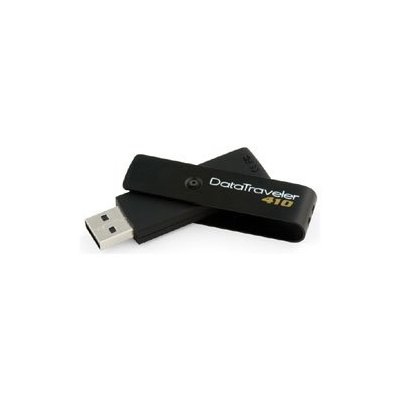
Windows Command Line Uninstall
Many thanks to tech-recipes for this tip on uninstalling software from the command line.
I'll next try it using psecec to run it remotely....
To go to WMIC mode, find the software, and uninstall:
1. Open a command prompt.
2. Input WMIC and press Return. You will see a prompt that looks like this:
wmic:root\cli>
3. At the new prompt, execute the following command:
product get name
This will generate a list of installed applications.
4. At the prompt, execute the following command:
product where name="" call uninstall
where application name is the name of the program you wish to uninstall (use the exact name provided by the previously generated list).
For example, if I were wanting to uninstall Adobe Reader 9, my command would look like this:
product where name="Adobe Reader 9" call uninstall
* optionally you can add the switch /nointeractive to bypass the confirmation, so it would look like this:
product where name="Adobe Reader 9" call uninstall /nointeractive
5. When prompted, input y to confirm that you wish to uninstall the application and press Return.
The application will be uninstalled.
Top 10 IT management trends for the next five years
Very worthwhile read for those of you in IT management. You've been warned!
Top 10 IT management trends for the next five years: "The top trends affecting technology infrastructure over the next five years can be summed up as largely a list representing where IT and users are battling for control over technology."
(Via Computerworld Breaking News.)
Monday, October 19, 2009
Gallery: 10 Cars Way Too Far Ahead of Their Time
A lot of articles in Wired seem a little short on substance to me but I do enjoy most of their automotive articles, they always manage to find some obscure stuff.
 "
"
Gallery: 10 Cars Way Too Far Ahead of Their Time: "Timing is everything, which is why these innovative cars didn't catch on. But sooner or later we embraced their technology.
(Via Wired: Top Stories.)
Windows 7 Week: Video guide: Windows 7 new features explained
A somewhat useful video presentation of some of the Windows 7 new features. I do wish it was more exciting but....

 "
"
Windows 7 Week: Video guide: Windows 7 new features explained: "
PCAnswers magazine Editor Christian Hall takes you through the impressive new features of the soon to be released Windows 7.
Discover how Jump Lists, Aero Peek, Aero Shake and more can help you get things done more efficiently.
Watch more PC tweaking and fixing video tutorials over on PCAnswers' YouTube channel.
Related Stories
| |
(Via TechRadar: All latest feeds.)
Auto refresh any web page
A helpful little tidbit for people newer to coding web pages....
 Last night when the Apple store went down, I got tired of hitting refresh in Safari every few minutes while waiting for it to come back up, and went searching for something that would do the job for free.
Now, this is not for coders who will laugh hysterically at my incompetence, but for those of you that are either lazy or don't program at all. I fit both categories.
Back in 2005 someone going by the moniker of Biovizier posted the solution on Macosxhints.com. It's a little html snippet that will refresh any web page as frequently as you'd like, and its easily customizable for any page at all.
Here it is:
Copy this into TextEdit and save it with an .html extension. Then just double click it.
You can change the refresh time from 60 to the amount of seconds you want to wait before the page refreshes, and you can change the URL to anything you want. I was using: http://apple.com/store and having it refresh every 20 seconds which must make me a certifiable fanatic.
Since I saw this I've found a ton of uses for it, like refreshing eBay auctions in the last few minutes, or just leaving it set for TUAW to see new stories coming up when I'm doing something else. At present I have four or five of these snippets in a folder on my desktop for different purposes.
Give it a try and see if you don't find a handful of uses for it.
Okay, you coders can stop laughing now.
Note: TJ Luoma just let me know that this tip won't work with Twitter which intentionally blocks this sort of thing.
Thanks to macosxhints.com and Biovizier wherever you are.


Sponsored Topics:
Twitter - Apple - Safari - TUAW - Unofficial Apple Weblog"
Filed under: Tips and tricks, Odds and ends, Internet Tools
Last night when the Apple store went down, I got tired of hitting refresh in Safari every few minutes while waiting for it to come back up, and went searching for something that would do the job for free.Now, this is not for coders who will laugh hysterically at my incompetence, but for those of you that are either lazy or don't program at all. I fit both categories.
Back in 2005 someone going by the moniker of Biovizier posted the solution on Macosxhints.com. It's a little html snippet that will refresh any web page as frequently as you'd like, and its easily customizable for any page at all.
Here it is:
 <html>

<head>

<**** **********='refresh' content='60'>

</head>

<body>

<FRAMESET>

<FRAME src='http://www.tuaw.com'>

</FRAMESET>

</body>

</html>
Copy this into TextEdit and save it with an .html extension. Then just double click it.
You can change the refresh time from 60 to the amount of seconds you want to wait before the page refreshes, and you can change the URL to anything you want. I was using: http://apple.com/store and having it refresh every 20 seconds which must make me a certifiable fanatic.
Since I saw this I've found a ton of uses for it, like refreshing eBay auctions in the last few minutes, or just leaving it set for TUAW to see new stories coming up when I'm doing something else. At present I have four or five of these snippets in a folder on my desktop for different purposes.
Give it a try and see if you don't find a handful of uses for it.
Okay, you coders can stop laughing now.
Note: TJ Luoma just let me know that this tip won't work with Twitter which intentionally blocks this sort of thing.
Thanks to macosxhints.com and Biovizier wherever you are.
TUAWAuto refresh any web page originally appeared on The Unofficial Apple Weblog (TUAW) on Wed, 30 Sep 2009 17:30:00 EST. Please see our terms for use of feeds.
Sponsored Topics:
Twitter - Apple - Safari - TUAW - Unofficial Apple Weblog"
Subscribe to:
Posts (Atom)